
Evergy Website Consolidation & Refresh
Project Overview: In early 2018, Evergy merged KCPL and Westar into a single site. During the transition and the early years that followed, the web team found the site needed a complete overhaul to make information easier for customers to find and and accessible. Since I started with the company in June of 2022, my team’s goal has been to consolidate related pages, remove unnecessary or orphaned content and outdated design, and implement a hub-and-spoke structure to guide customers more effectively to the information they need.
To inform our approach, we analyzed peer utilities and leading transactional websites to identify UX best practices and modern design patterns that support clear, efficient customer journeys. This exploration helped us understand how similar organizations structure content, prioritize tasks, and reduce friction in high-value interactions such as payments, account management, and service requests. By combining these external insights with our internal stakeholder needs, we were able to identify proven solutions and adapt them to fit our ecosystem which helped us ensure our designs are both user-centered and aligned with current industry standards.
Lead Team: manager, content writer, web designer (my role)
Duration: June 2022 - Present
Impact:
Streamlined site architecture reducing content redundancy and improving overall usability
Improved SEO performance through clearer structure, optimized content, and better indexing
Enhanced support for agentic AI and search experiences by creating structured, well-organized, and machine-readable content
Reduced maintenance effort through consolidated content and more scalable content models
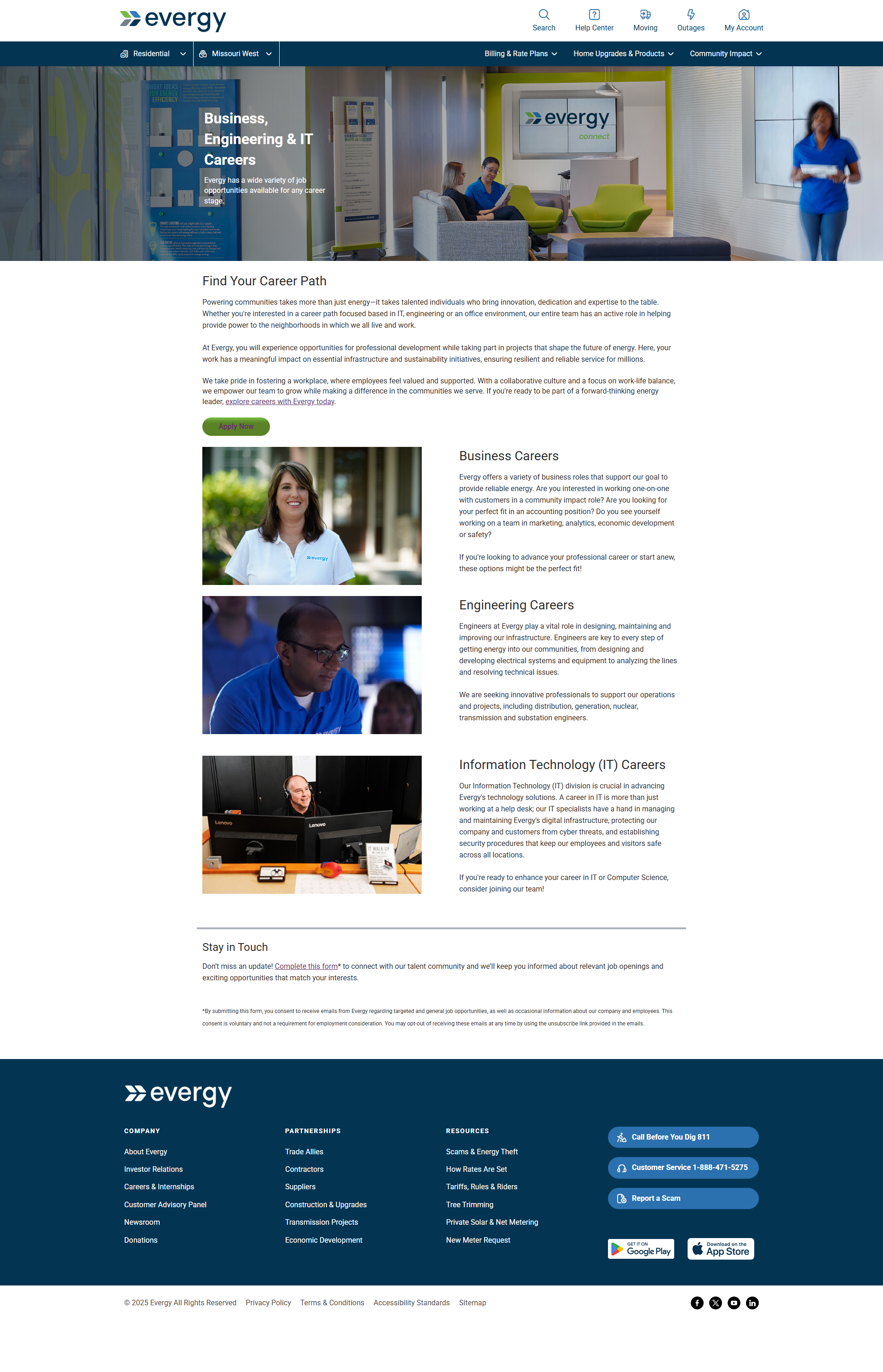
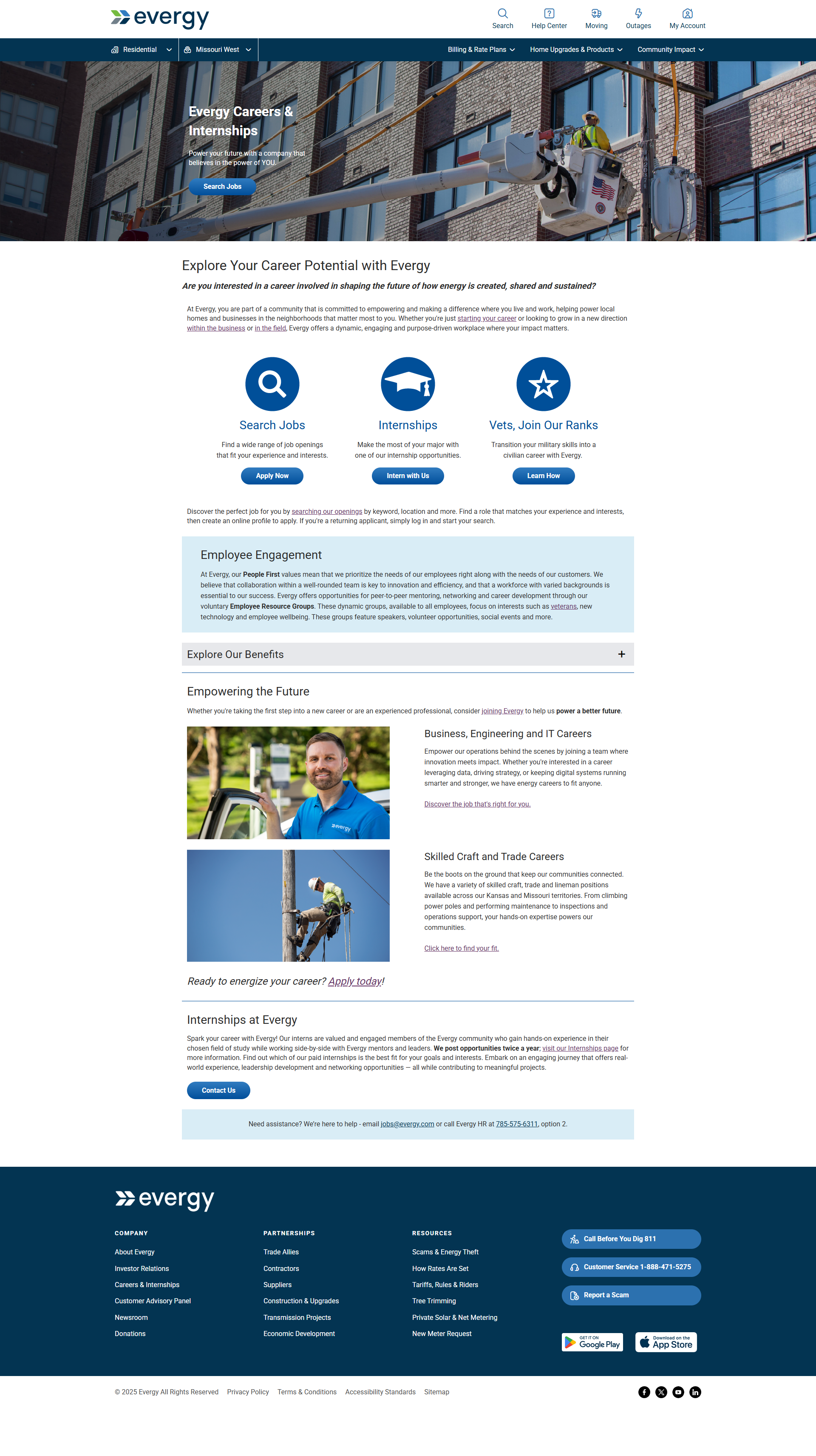
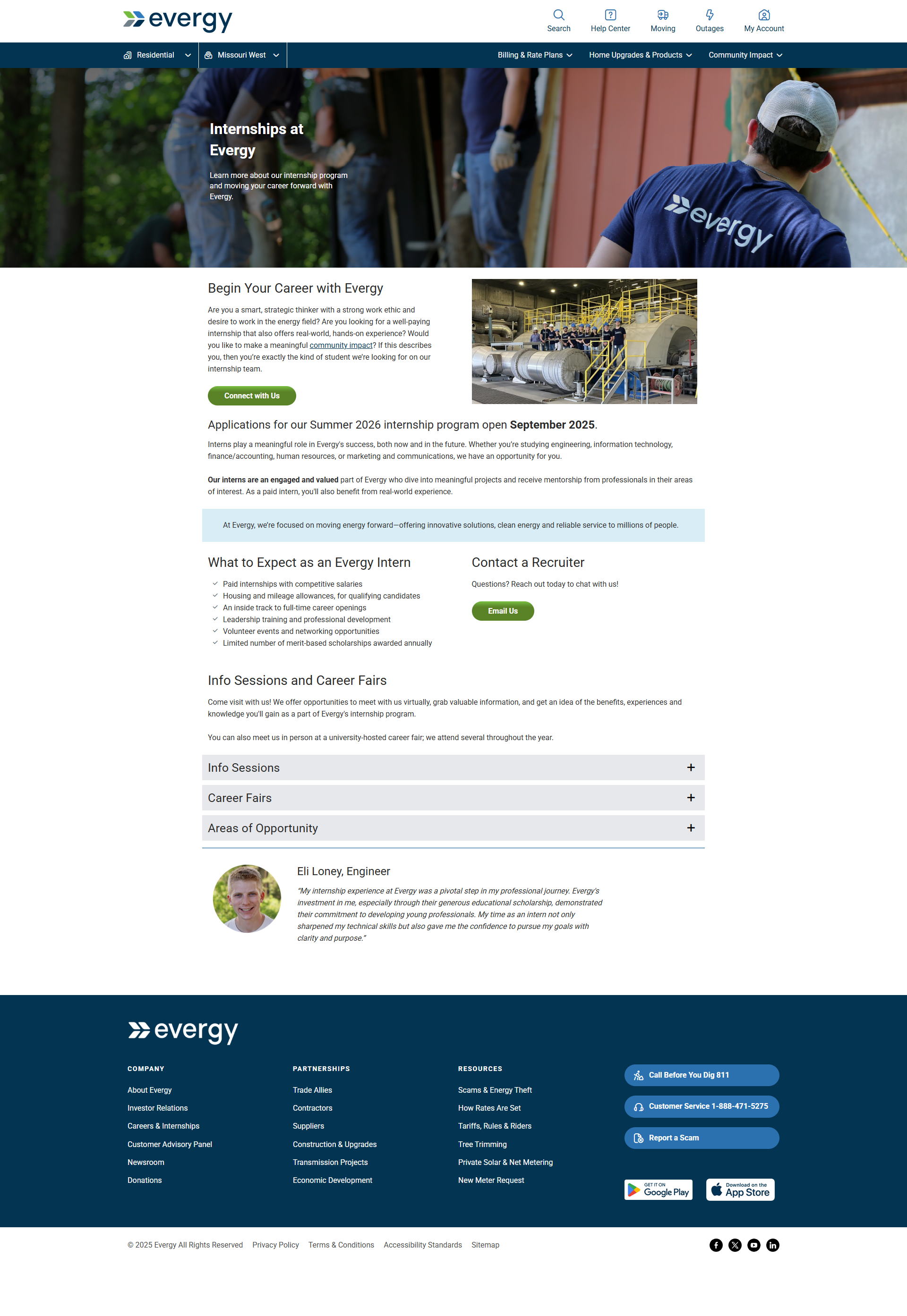
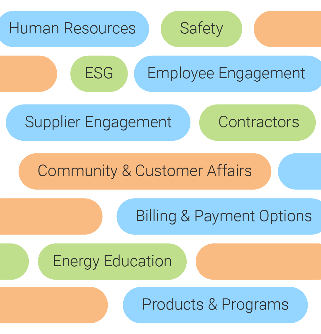
Discovery Sessions with Stakeholders
This project inherently involved a wide range of stakeholder groups, each with distinct objectives, priorities, and measures of success. Key groups such as HR & Employee Engagement, Corporate Sustainability, Community Affairs, Supplier Engagement, Billing & Payments, Energy Education, and Products all interact with content in unique ways, shaped by their specific business goals and audience needs.
These differing priorities mean that stakeholder goals are not only diverse, but also continuously evolving. Regulatory changes, shifting business strategies, customer expectations, and emerging technologies all influence how each group defines success over time.
Project Process:
Discovery Deep Dive, Collaborative Workshops, Sitemap Creation, Design Environment Staging, Stakeholder Share-Out, Iterate & Refine, Launch & Publish
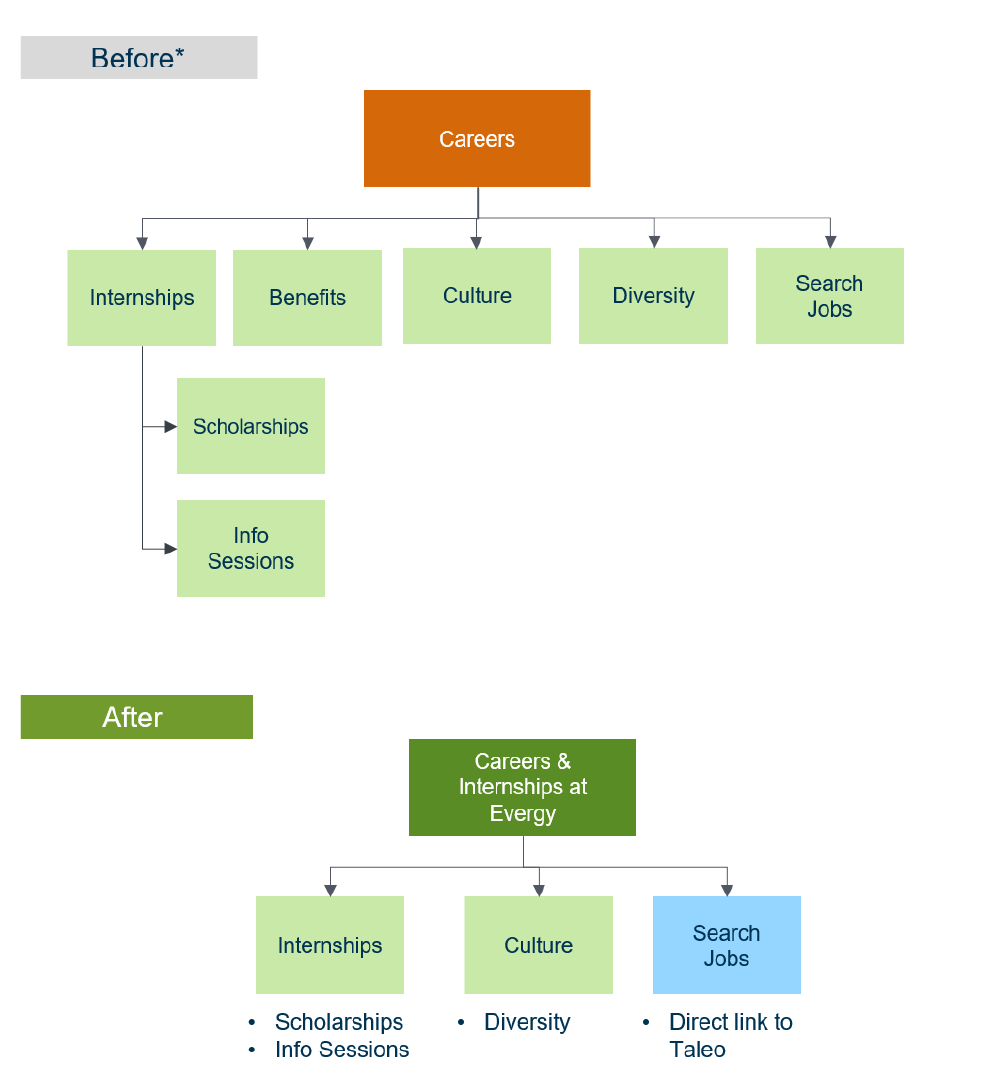
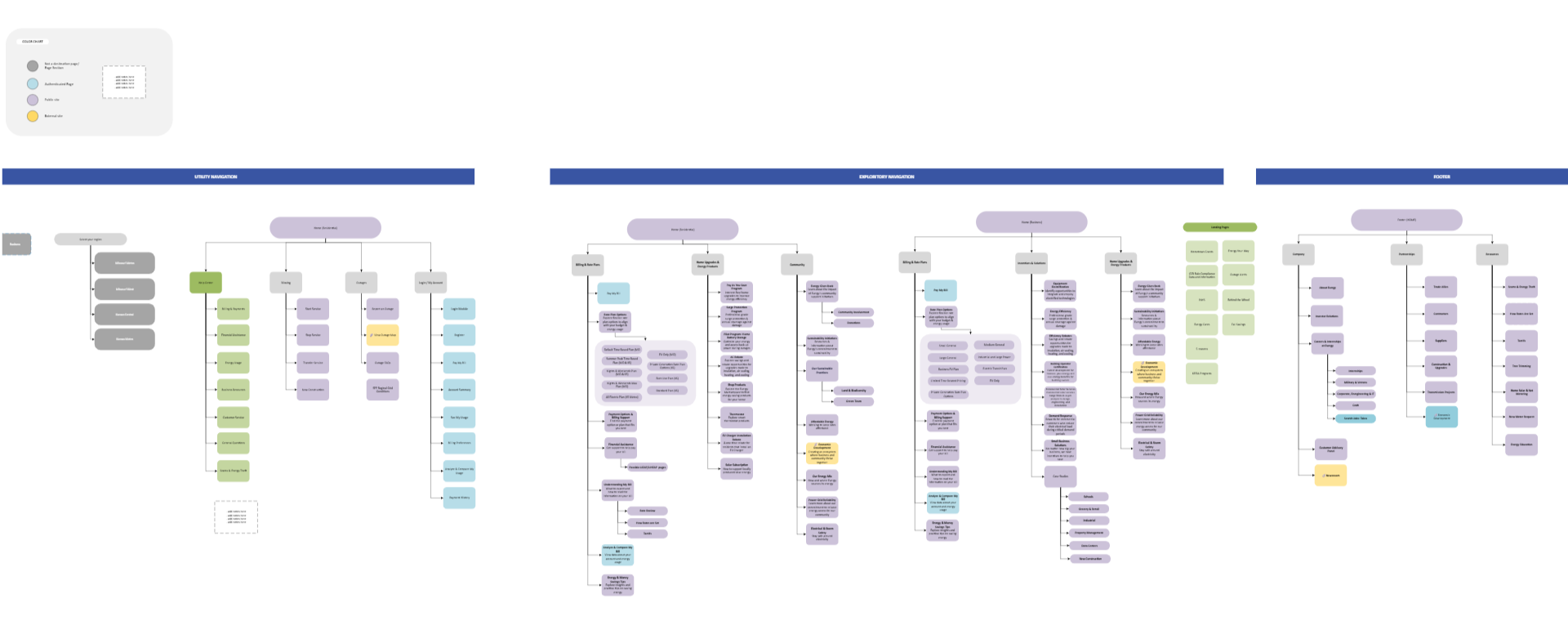
Building the sitemaps
As part of the consolidation effort, we developed a dedicated sitemap for each content section, working closely with stakeholders to organize information in a way that aligns with both business priorities and user needs. Our approach prioritized simplicity, intentionally mapping the most direct and intuitive paths for customers to complete key tasks or find relevant information. By reducing unnecessary layers, grouping related content logically, and eliminating redundancies, we created streamlined structures that improve usability while still supporting each group’s unique goals. This process ensured that every section contributes to a cohesive, easy-to-navigate experience across the broader ecosystem.
This approach was scaled and replicated to create a refreshed, unified sitemap for the entire site, ensuring consistency and simplicity across all sections.
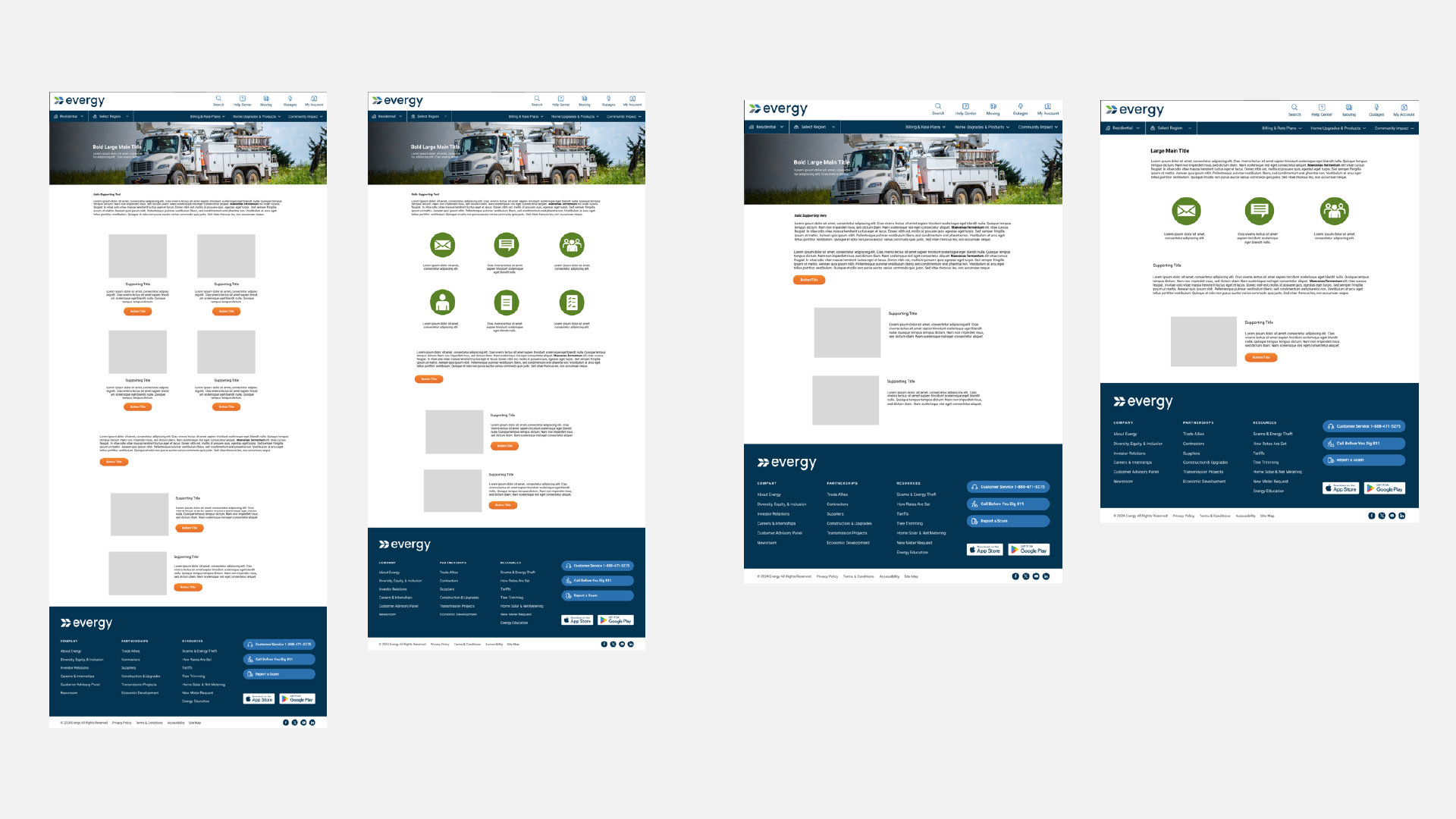
Layout Structure
Throughout the process, we prioritized the use of consistent layouts to create a cohesive and predictable user experience across all sections. By establishing shared design patterns and structural frameworks, we ensured that content is presented in a familiar, easy-to-navigate format—regardless of the topic or stakeholder group. This consistency not only reduces cognitive load for customers but also supports scalability, making it easier to maintain and evolve content over time. At the same time, the layouts were flexible enough to accommodate the unique needs of each section, striking a balance between standardization and customization.
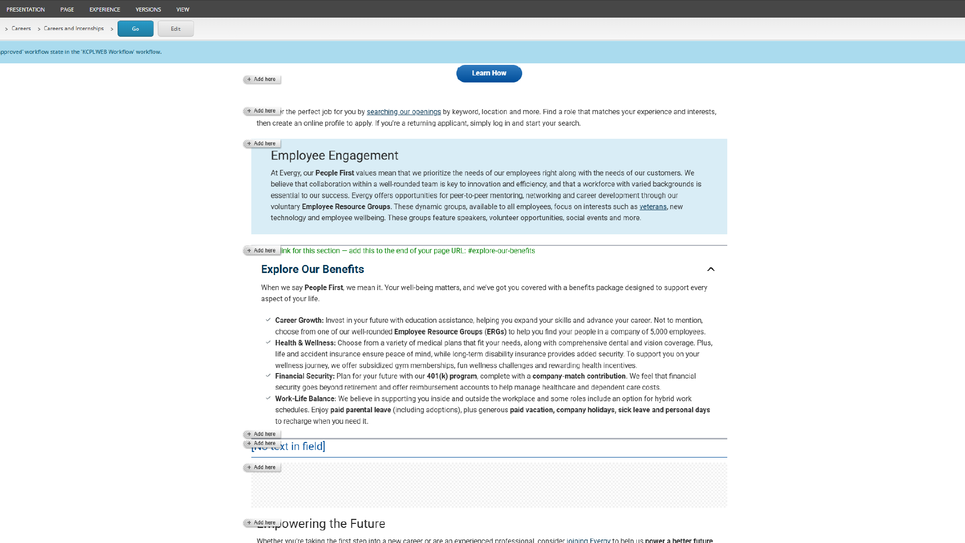
Building in Sitecore
As we built and refined page layouts, we worked within the capabilities and structure of Sitecore to ensure our solutions were both practical and scalable. This meant designing with reusable components, flexible templates, and modular content in mind - allowing our team to efficiently create, update, and manage pages without duplicating effort
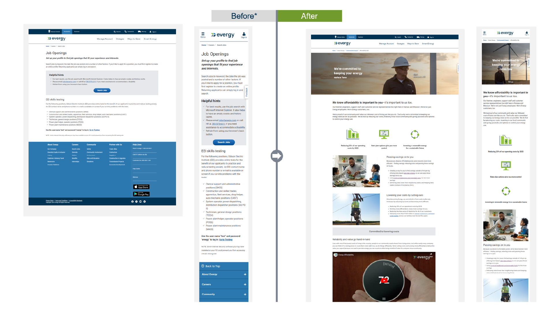
Overall, the process transformed a complex, fragmented design landscape into a more streamlined, cohesive, and user-centered experience. Initially, content was often siloed across stakeholder groups, with inconsistent structures, duplicated information, and unclear pathways for users. Through our structured, collaborative approach (focused on discovery, alignment, and iterative refinement) we were able to consolidate and simplify both content and design while respecting each group’s goals. The result was a unified system of intuitive sitemaps, consistent layouts, and scalable components that improve the site’s usability and findability, but also make ongoing and future enhancements significantly more efficient for our team.
From Complexity to Cohesion


Site Experience Enhancements
Ongoing updates and improvements designed to refine usability, streamline interactions, and deliver a more intuitive, user-friendly experience across the site.

Homepage Redesign
For a user-centric and customer focused design, a website refresh was done. This meant updating the customer facing homepage.
The homepage hero was shortened and made to fit the screen full width so that the page would be adaptive and responsive to any screen size.
The ‘how can we help you today?’ section now includes 4 buttons with added designs and text. These quick action buttons, also known as customer self service, help convey Evergy’s main services.
Below the quick action buttons section, we have the hover pods section. The three buttons in the hover pods section serve as promotional content pods for Evergy. During the website refresh, I provided specification sheets for development to incorporate these changes to go into production. User testing was also done to note if the changes were significant, and the user experience is notably better after the website refresh. The website refresh is a continuous project, with this phase being complete.
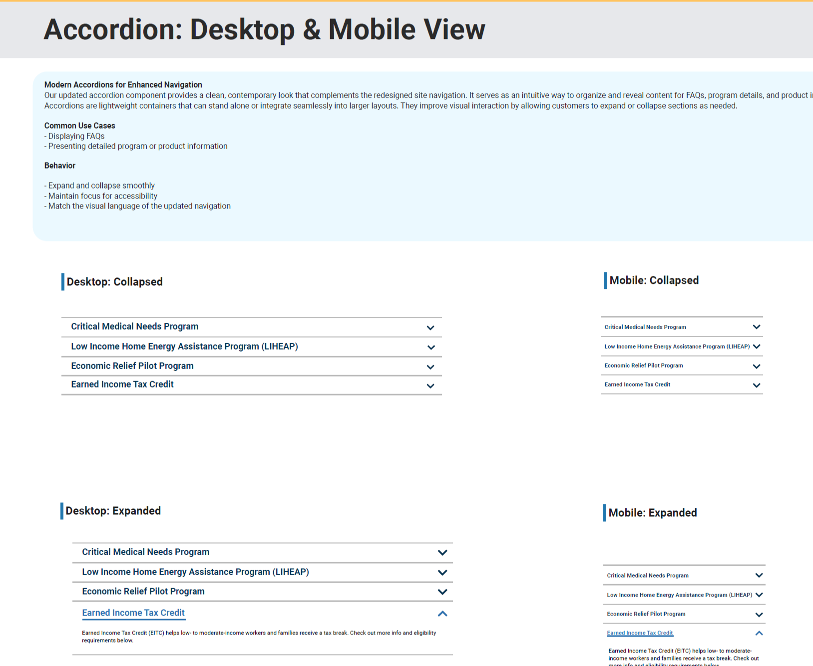
Accordion Refresh
A modernized approach to expandable content that replaces heavy, blocky visuals with a lighter, more open design. The updated accordion feels cleaner and more approachable, improving readability while creating a smoother, more contemporary user experience.
This is currently in development with our dev support team.